DDD1007: Assessment 1: Design Development Case-study Post 4

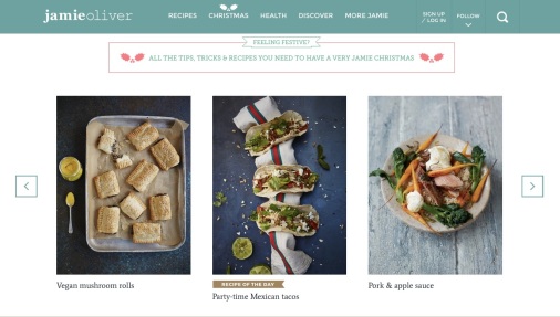
As I reach the end of the design iteration process I believe I have achieved a highly intuitive website design that users can easily navigate on any device.  It will therefore require no ‘help’ menu as basic operations and troubleshooting will be clear and simple with forgiveness principles built in, such as good affordances,  and reversibility of actions (Lidwell p104).  These will be achieved with clear web design characteristics which provide clear navigation between pages and the ability to reverse out of content easily and return to the homepage.  Sites that do this, like the Sydney Morning Herald below, often rely on the user having very observant eyes (the highlighting below is mine).

SMH(Sydney Morning Herald, 2016)

I want to extend communication on the subject of design by utilising PRIA’s existing Facebook and Twitter feeds with complementary content.   PR professionals will be able to ‘Like’ PRIA’s value of design content to receive further news and information about communication design principles.  However the garbage-in garbage-out principle comes into play here (Lidwell, p112).  PRIA’s content expansion will only be considered valuable if the content promulgated on social media platforms is carefully chosen and  the quality is high.

The final iteration of my document design is outlined (with draft content) below which has been through some user acceptance testing designed to test functional usability.

DesignHomepage

Homepage Design

WebDesignpageA content page example.

References:

Lidwell, W., Holden, K., & Butler, J. (2010). Universal Principles of Design: 125 Ways to Enhance Usability, Influence Perception, Increase Appeal, Make Better Design Decisions, and Teach Through Design. Beverly, MA.: Rockport Publishers.

Sydney Morning Herald 2016, viewed 30th January 2016, <http://www.smh.com.au/nsw/sydney-barbecue-festival-at-domain-fails-to-sizzle-outraged-patrons-claim-20160130-gmhus4.html&gt;


DDD10007: Assessment 1: Design Development Case-Study Post 3

Don Norman’s description of the knife that is both startlingly beautiful and also beautifully functional (Matz, K. 2012) is inspiring  the development of my document design.  His declaration “that pleasant things work better” (Matz, K. 2012) is pushing my design toward a user experience that will promote happiness and subsequently inspire “breadth type thinking” (Matz, K. 2012) from PRIA’s members .  I want them to think creatively about design after encountering my document.

My choices of font, colors, and imagery will all complement the functional form of the document, i.e. the depth and breadth of content promoting good design.   I want users to feel in control of both  their usability and their understanding of the subject.   I like how the Guardian website for Palm-Oil education  (below) does this to great effect with this menu of icons down the right-hand side of the site.  Each one is clearly labelled when hovered over and easily links through to deeper content.

PalmOil

(The Guardian, 2014)

I’ve been focusing heavily on the Accessibility principle of Simplicity; described by Lidwell (2010, p16) as being achieved when a diverse group, such as PRIA’s membership, can use the design.     My focus is on the lower levels of the hierarchy of needs principle regarding functionality (Lidwell 2010, p124) first and foremost,   with the 2 higher levels of Proficiency and Creativity (Lidwell 2010, p124) being the ultimate goal.    I am inspired by the McGrath Foundation website (below)  which uses a snappy catch phrase to inspire positive action (maybe I’ll devise a memorable good design phrase for my design content).

CurveLurve

(Curve Lurve, 2014)

WebDesign3

The latest iteration of my design (above)

References:

Matz, K. (2012). Don Norman’s design principles for usability. Architecting Usability, accessed 6 January 2016, <http://architectingusability.com/2012/06/28/donald-normans-design-principles-for-usability/&gt;

The Guardian 2014, The Story of Palm Oil,  The Guardian, viewed 9th January 2016, <http://www.theguardian.com/sustainable-business/ng-interactive/2014/nov/10/palm-oil-rainforest-cupboard-interactive&gt;

Lidwell, W., Holden, K., & Butler, J. (2010). Universal Principles of Design: 125 Ways to Enhance Usability, Influence Perception, Increase Appeal, Make Better Design Decisions, and Teach Through Design. Beverly, MA.: Rockport Publishers.

McGrath Foundation 2014, Curve Lurve, McGrath Foundation, viewed 8th January 2016,  <http://www.curvelurve.com.au/&gt;

DDD10007: Assessment 1: Design Development Case-study Post 2

The Public Relations Institute of Australia (PRIA) has a diverse online membership across Australia with varied levels of skill and expertise.     Accessibility principles therefore need to be given careful consideration.

Simplicity is achieved when a design can easily be understood by everyone regardless of experience, literacy, or concentration level (Lidwell 2010, p16) so my webpage design must limit any unnecessary complexity, be clear and consistent in function and labels,  only contain information for the audience it is intended for and ensure that language used accommodates a wide range or literacy (Lidwell 2010, p16).  The Guardian website (below) provides a good example of these simplicity principles in practice, particularly with regards to the clarity of language it uses to report the news.

Guardian1

(The Guardian 2015)

Both this website and  Jamie Oliver’s below have considered the design principles of tolerance of error and size and space for  approach and use (Universal Design 2015).   Both sites have minimal room for encountering errors when they are manipulated by the user and  both are appropriately resized for all mobile platforms meaning that these home pages highlighted here look just as effective on my Ipad, Iphone, or MacBook Air (Universal Design 2015).

JamieOliver

(Jamie Oliver, 2015)

These websites also have savanna-like characteristics in that they have clear unobstructed views and ordered simple design features (Lidwell 2010, p212).

I am now considering how ‘The Value of Design in PR’ webpage might differ from PRIA’s existing web format, which I was relying upon earlier with the addition of RSS feeds and traditional menu options.  I’m toying with the idea of placing points of prospect in non-traditional places (see below) that still enable easy orientation and the ability to survey easily the available options (Lidwell 2010, p80), whilst retaining strong and clear aesthetics.

pria

References:

Lidwell, W., Holden, K., & Butler, J. (2010). Universal Principles of Design: 125 Ways to Enhance Usability, Influence Perception, Increase Appeal, Make Better Design Decisions, and Teach Through Design. Beverly, MA.: Rockport Publishers.

The Guardian 2015, ‘Gun control: New York Times runs front page editorial for first time since 1920’, The Guardian, 6th December, viewed 6th December 2015, < http://www.theguardian.com/media/2015/dec/05/gun-control-new-york-times-ront-page-editorial-first-time-since-1920-san-bernardino&gt;

Jamie Oliver 2015, homepage, viewed 5th December 2015, <http://www.jamieoliver.com&gt;

Universal Design.com 2015, The Seven Principles of Universal Design , Universal Design, viewed 5th December 2015, <http://www.universaldesign.com/universal-design/1761-the-seven-principles-of-universal-design.html&gt;


DDD10007: Assessment 1: Design Development Case-study Post 1

PRIA’s website is designed using a descriptive interpretation of ‘form follows function’ . This has resulted in a website homepage that has limited aesthetic considerations secondary to its designed functional intentions  (Lidwell 2010, p106).   A ‘Value Of Design in PR’ webpage that follows the same functional form but with equal attention to design aesthetics and is accessed from an intuitive position on the homepage, will have the potential to reach the majority of the PRIA membership.

Slide1

(Public Relations Institute of Australia, 2015)

Through both form and content the webpage will, for example, demonstrate the use of multiple levels of saturated corporate colors to create different perceptions of seriousness and playfulness (Lidwell 2010, p48) whilst also retaining brand consistency (p56). See above how the use of a complementary color (orange) to denote action points is an effective design method.

Language will be framed to encourage a playful positivity about the use of design (Lidwell 2010, p109) rather than a set of rules.

With limited understanding of the memberships existing design knowledge, it is not yet clear how flexible the webpage should be.   With limited time and budget for this project however, the webpage should favour usability over flexibility. It is therefore desirable that PRIA gain a greater understanding of their memberships needs in order to be satisfied by webpage content that is effectively specialised (Lidwell 2010, p102).

The design of the webpage will focus foremost on the functional, proficiency, and creativity levels of the ‘Hierarchy of Needs’ (Lidwell 2010, p124) in order to achieve a tangible outcome for the association.    Whilst ease of use is crucial, inspiring good design by PR professionals will be achieved with a strong focus on the 2 higher level needs.

The potential format for the webpage (document) is drafted below.

sketch

References:

Lidwell, W., Holden, K., & Butler, J. (2010) Universal Principles of Design: 125 Ways to Enhance Usability, Influence Perception, Increase Appeal, Make Better Design Decisions, and Teach Through Design. Beverly, MA.: Rockport Publishers.

Public Relations Institute of Australia 2015, Homepage, viewed 11 November 2015, <http://www.pria.com.au&gt;